
Are you ready to stop making your funny t-shirts look like amateur hour disasters? Well, get your game face on, because we're about to dive into the seven biggest blunders that are sabotaging your shirt game! Whether you're designing for your own wardrobe or trying to conquer the custom apparel market, these mistakes are more common than you think, and way easier to fix than you'd imagine.
Let's face it: creating genuinely funny t-shirts that people actually want to wear (and buy!) is trickier than it looks. You might think slapping a random meme on a shirt equals instant comedy gold, but hold your horses there, design warrior! There's a whole science behind what makes people chuckle, nod approvingly, and most importantly, reach for their wallets.
From generic graphics that scream "I bought this at a gas station" to color choices that make people's retinas weep, we're covering all the fashion faux pas that turn potential comedy gold into wardrobe flops. So dust off your creative thinking cap and sharpen your design elbows, it's time to transform those shirt-fails into shirt-wins!
Mistake #1: Going Generic with Your Graphics
The Problem: You're picking clip art that screams "I've seen this on every corner of the internet!" Generic smiley faces, overused memes from 2015, and those tired old "Keep Calm and..." templates are about as fresh as last week's leftover pizza.
The Fix: Time to get original, my friend! Instead of reaching for the same tired graphics everyone else is using, create something that makes people do a double-take. Think about what makes your sense of humor unique. Are you into dad jokes? Craft something that would make even the corniest father figure proud. Love wordplay? Get punny with it (but make it clever, not cringe-worthy)!
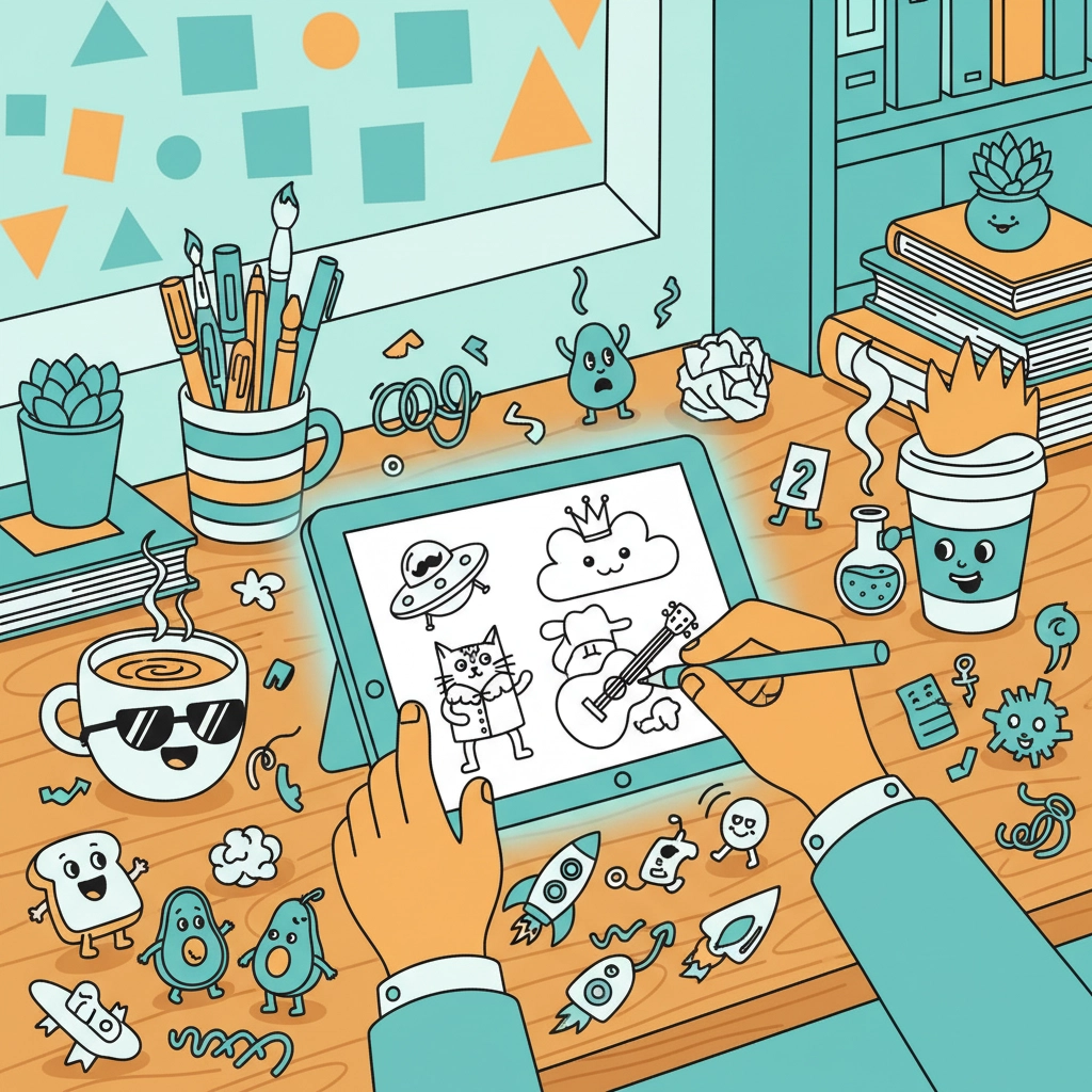
Pro tip: If you absolutely must use existing elements, remix them in unexpected ways. Take that basic coffee cup graphic and give it sunglasses and a mohawk, now you're cooking with creative gas!
Mistake #2: Ignoring the Fit Factor
The Problem: You've designed the funniest shirt in human history, but it looks terrible because you forgot that shirts are, well, worn by actual human bodies! Designs that work great on a computer screen can look wonky when stretched across different body types and sizes.
The Fix: Always think about placement and scale! Your hilarious one-liner shouldn't wrap around someone's torso like a billboard advertisement. Keep text and key design elements in the sweet spot, roughly in the chest area where people naturally look when they're trying to read your shirt.
Consider how your design will look on different sizes too. That tiny font might be readable on a small, but it'll be microscopic on an XXL. And please, for the love of all that's comfortable, don't put text or graphics where they'll stretch weirdly across curves (nobody wants their punchline distorted)!
Mistake #3: Misreading Your Audience's Humor
The Problem: You think your inside joke about obscure 90s cartoon references will land with everyone, or you're going for shock value that just makes people uncomfortable rather than amused.
The Fix: Know your crowd! Humor is incredibly subjective, but there are some universal truths. Self-deprecating jokes often work better than making fun of others. Clever wordplay beats crude humor most of the time. And timing matters, what's hilarious today might be cringe tomorrow.

Test your humor on real people before committing to production! Share your design concepts with friends, family, or online communities. If people are genuinely laughing (not just being polite), you're on the right track. If you're getting blank stares or awkward silence... well, back to the drawing board!
Mistake #4: Overcomplicating Your Design
The Problem: You've crammed seventeen different fonts, forty-two colors, and enough graphics to make a circus poster jealous all onto one poor, overwhelmed t-shirt. Less is more, people!
The Fix: Simplicity is your secret weapon! The best funny t-shirts deliver their punchline quickly and clearly. Stick to one main joke or concept per shirt. Use no more than two or three colors (your printer and your bank account will thank you). And for the love of readable text, limit yourself to one or two fonts maximum.
Think of it like telling a joke in person, you wouldn't interrupt your punchline with seventeen tangents and costume changes, right? Same principle applies to shirt design. Make your point, make it clear, and make it memorable!
Mistake #5: Making Terrible Color Choices
The Problem: You've chosen colors that clash harder than cymbals in a thunderstorm, or you've gone with combinations that make your text completely invisible against the shirt background.
The Fix: Color theory isn't just for art school dropouts, it's your ticket to designs that actually pop! High contrast is your best friend. Dark text on light shirts, light text on dark shirts. It's not rocket science, but you'd be amazed how often this gets messed up.
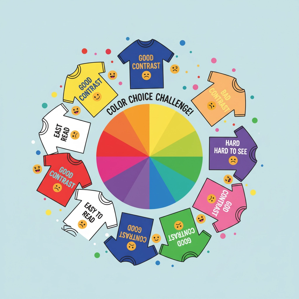
Stick to colors that complement rather than compete. If your joke is the star of the show (which it should be!), don't let flashy neon colors steal the spotlight. And please, test your color combinations by actually looking at them from across the room: if you can't read your shirt from ten feet away, neither can anyone else!
Mistake #6: Skimping on Quality
The Problem: You've gone bargain basement on materials and printing, thinking people won't notice. Spoiler alert: they absolutely will! Cracked graphics after one wash and shirts that feel like sandpaper aren't doing your humor any favors.
The Fix: Quality is non-negotiable! Invest in decent blanks and proper printing methods. Your hilarious design deserves a shirt that won't fall apart faster than a house of cards in a hurricane. People associate quality with value: if your shirt feels cheap, they'll assume your humor is cheap too (even if it's comedy gold!).
Research your printing options. Screen printing for larger runs, direct-to-garment for smaller batches, heat transfer vinyl for one-offs. Each method has its sweet spot, so choose wisely based on your needs and budget.
Mistake #7: Missing the Pop Culture Mark
The Problem: Your references are either so obscure that only three people on the planet will get them, or so overused that they've lost all comedic impact. Finding that sweet spot of recognizable but not overdone is trickier than it looks!
The Fix: Stay current but not too current! Pop culture references should be recognizable enough that your target audience gets them immediately, but fresh enough that they're not tired. Think about references that have staying power: classic movies, timeless TV shows, or universally known memes that haven't been beaten to death.
Pro tip: Put your own spin on popular references rather than just copying them verbatim. Take something familiar and twist it in an unexpected direction. That's where the real comedy magic happens!
Bonus Round: Putting It All Together
Now that you know what not to do, it's time to channel all this knowledge into creating shirts that are actually funny, wearable, and memorable! Remember, the best humorous apparel makes people smile first and think "I need this in my life" second.
Start with a solid concept, keep your design clean and readable, choose quality materials, and always: always: test your humor on real humans before going to print. Your future customers (and your reputation) will thank you for taking the extra time to get it right!
So there you have it: seven mistakes that could be sabotaging your funny t-shirt game, plus the fixes that'll turn you into a comedy apparel champion! Now stop reading and start creating some shirt magic that'll have people laughing from here to next Tuesday!
0 comments